

Optimizing IKEA's Online Shopping Experience
Web Experience
Role
Product Designer
UX Researcher
Timeline
5 Months
(Jan 2024 - May 2024)
Tools
Figma, Maze, Qualtrics, Photoshop, Optimal Workshop
Team
Individual project with faculty and industry professional guidance
IKEA is loved for its in-store shopping experience, where customers can wander, compare, and visualize products in real contexts. Online, however, that ease breaks down, creating friction for users. This project focuses on enhancing IKEA’s website by benchmarking against Wayfair and identifying opportunities to improve navigation, product comparison, and overall satisfaction. My role spanned user research, usability testing, and product design, leading to solutions that made the platform more seamless, intuitive, and accessible.
CONTEXT AND PROBLEM
IKEA thrives on its in-store model: people can browse entire rooms, compare items, and visualize choices. Online, users often feel disoriented.
Why Web (not Mobile)?
-
The mobile app is already optimized with shopping tools for repeat users.
-
First-time and high-consideration shoppers typically start on the web.
-
Research showed larger screens support easier comparison and cart-building, key for IKEA’s multi-item shopping.
How might we translate IKEA’s in-store discovery and decision-making into a seamless digital web experience?
TARGET AUDIENCE
IKEA’s online shoppers are increasingly younger digital natives. Research shows that the digital engagement of individuals under the age of 34 is profoundly shaping online shopping trends.
-
The age of 34 has been dubbed the "Ikea breakup age" in popular culture.
-
78.7% of individuals under the age of 34 years shop online.
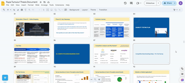
RESEARCH PROCESS
The project followed a structured five-phase research process:
-
Preliminary Research – Understanding IKEA’s digital presence and overall e-commerce market.
-
Field Study – Observing how users currently browse IKEA online and in-store.
-
Benchmarking Study – Comparing IKEA with Wayfair.
-
Preference Testing – Collecting user feedback on early design concepts.
-
Rapid A/B Testing – Iterating quickly to validate variations.

IKEA vs Wayfair - Competitive Benchmarking Study (Thematic Analysis)


KEY FINDINGS
9 out of 10 users couldn't identify or recognize the existing IKEA compare feature on their website. The research revealed four major usability pain points that did not align with fundamental UX principles and UI heuristics.
1. Comparison & Decision-Making: No side-by-side attribute comparison (e.g., dimensions). Comparison tool hard to find and it only appears on hover.
2. Return Policy & Accessibility: Policy information buried and difficult to understand.
3. Recently Viewed Items: Feature missing or not prominent, forcing users to re-search.
4. Price & Discount Clarity: Inconsistencies in displaying prices and discounts.

"I did say that... Should be able to compare two products in the same window."

"I think the return policy is there in the footer."
"I have to navigate through three tabs separately and then compare."

"I always open them in a new window so I don't lose my progress."

"I give them a chance. I didn't find it on their website and I lost my patience. So I'm just gonna Google. Okay, so have a year, six months."

User Stories
Current way of how users are comparing products
Enable Clear Product Comparison
Improve Return Policy Visibility
Highlight Recently Viewed Items
Clarify Pricing and Discounts
DESIGN PROCESS AND ITERATIONS
I used wireframes, and usability feedback to refine solutions for the four main usability problems.


Exploring multiple wireframe variations
Usability testing to identify pain points and improve designs
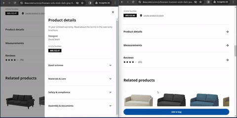
Product Comparison
Before: Comparison feature hidden, only available on hover.
After: Dedicated side-by-side comparison page with visible entry points.
Current

Compare button visible on hovering

Compare button placement
Recommendation
.png)
.png)
.png)
Return Policy Visibility
Before: Return policy buried in long footer, hard to locate.
After: Clear, up front return policy link on product pages.
Current
Return Policy button placement
Recommendation

Return Policy button along with the product details for easier visibility
Recently Viewed Items
Before: No easy way to revisit previously browsed items.
After: A persistent “Recently Viewed” carousel on product listing pages.
Current
No Recently Viewed Items to be found easily
Recommendation

A fixed Recently Viewed Items carousel
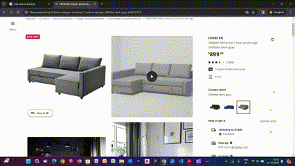
Pricing and Disocunts
Before: Inconsistent placement and formatting of prices/discounts.
After: Standardized pricing layout with clear, consistent discount labeling.
.png)
Discounts viewed as per heuristics
IMPACT AND OUTCOMES
Validated using Rapid A/B Testing (10 Participants)
70%
Product Comparison Success Rate
Moving the compare button under product info increased discoverability and enabled smoother interaction.
90%
Return Policy Success Rate
Placing return policy details beside product info boosted visibility and feature usability.
100%
Recently Viewed Success Rate
Adding a fixed placeholder and home screen section let all users continue shopping seamlessly.
80%
Price & Discount Success Rate
Standardizing price display with clear red discounts and strike-throughs improved clarity and decision-making.
REFLECTIONS AND LEARNINGS
-
Strategic Scoping: Choosing web maximized user impact
-
Design Trade-offs: Comparison flow needed balance between detail and simplicity
-
Collaboration Counts: Faculty advisors + industry professionals sharpened usability methods and decision-making.