Product Redesign of SalesGo CRM Application
Mobile Application
Role
Product Designer
UX/UI Designer
Timeline
9 Months
(Aug 2021 - Apr 2022)
Tools
Figma, Miro, Qualtrics, Photoshop, Otter AI, Trello
Team
Collaborated with product managers, executives, developers, and director
As the sole designer, I worked on the end to end redesign of the SalesGo 2.0 CRM application. My work covered the entire product cycle from conducting user research and creating personas and journey maps to defining information architecture and building wireframes, prototypes, and a scalable design system. I collaborated closely with leadership and engineering teams to ensure alignment, tested iteratively to validate design decisions, and supported development through handoff and reviews. This process culminated in the successful launch of SalesGo 3.0 on the Google Play Store in April 2022 where it was adopted by major Indian banks and their sales teams.
CONTEXT AND PROBLEM
Sales executives and managers need an app that works at their speed, simplifies logging, scheduling etc. instead of making their day longer.
Sales executives and managers in Indian banks juggle packed schedules, client visits, follow ups, logging leads, and analyzing reports. SalesGo 2.0 was meant to support them, but inefficient workflows, accessibility gaps, and inconsistent UI made their jobs harder.
Time consuming onboarding and account creation
Inefficient visit logging and lead updates
Fragmented reporting dashboards
Inconsistent user interface and no design system
How might we redesign SalesGo to make life easier for busy professionals, helping them log visits faster, schedule smarter, and manage follow-ups without wasting valuable time?
TARGET AUDIENCE
Primary Users: Sales teams in Indian banks (Executives and Managers)
Sales Executives (21–45 yrs): Log client visits, follow-ups, leads.
Sales Managers (30–60 yrs): Track team performance, analyze pipelines, generate reports.
User Needs:
Speed
Accuracy
Accessibility
Consistency

RESEARCH PROCESS
Conducted interviews and usability tests to uncover pain points, and developed information architecture and feature plans to redesign SalesGo 2.0 application.
1. Interviews with sales executives and managers.
I conducted interviews with sales executives and managers to comprehend their daily tasks, motivations, schedules, roles and responsibilities. Additionally, I inquired about their familiarity with other tools they use to accomplish their professional goals and their desired features.
Interviews with sales executives and managers revealed their distinct needs. I built personas and mapped daily journeys to ensure effective workflows
Executive Persona: Needs fast, mobile-friendly logging with reminders.
Manager Persona: Needs consolidated dashboards to track performance and pipeline health.

Usability Testing Questionnaire


Understanding roles and responsibilities of sales executives and managers

User Interviews : Executives and Managers

Persona and Empathy Mapping
2. User Journey Mapping

KEY FINDINGS
The research revealed four major usability pain points that did not align with fundamental UX principles and UI heuristics
-
Account creation was slow and confusing, leading to onboarding delays.
-
Lead and visit logs were error prone due to multi step forms.
-
Reports and dashboards were fragmented across screens.
-
Scheduling and updating were time-consuming, making it difficult for executives and managers to manage their busy days.
Onboarding
Account Creation
Updating Meetings
Scheduling
Streamline account creation and onboarding for quick adoption.
Simplify lead and visit logging for executives and managers.
Unify dashboards to give managers clear reporting.
Design update flows that are simple and intuitive.
DESIGN PROCESS AND ITERATIONS
Designed end to end workflows by creating information architectures, feature planning, wireframes, building prototypes, and refining high-fidelity designs through iterative testing.
Information architecture and roadmap planning for 3.0 → 3.2.


Information Architecture for SalesGo 3.0 version
Feature sorting and planning
Wireframes

Color & Visual Options
I explored multiple color palettes and visual treatments to balance brand consistency with readability and accessibility. Options were compared using contrast checks and evaluated in the context of daily usability.

UI Options & A/B Testing
As part of the visual exploration, I tested multiple UI themes and color indication styles with a group of 10 participants. The goal was to ensure the interface was both readable and intuitive for busy sales executives and managers.
Between dark and light themes, the lighter option was chosen for its superior contrast and readability during long usage sessions.
Dark Theme

Light Theme

BIGBRO Indication

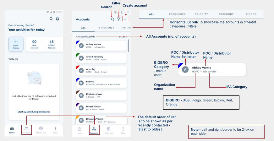
For account categorization colors (Blue, Indigo, Green, Brown, Red, and Orange), users preferred the top-left corner color block over a thin line. The corner indicator was more prominent, making account categories easier to recognize at a glance.
Header Alignment


For card spacing and header alignment (welcome line and icons), users preferred the aligned header option. This alignment optimized vertical space, ensured the card text was not cut off, and allowed more account details to be visible clearly without clutter.
Microinteractions
To make SalesGo application feel responsive and engaging, I designed subtle microinteractions and microanimations directly in Figma
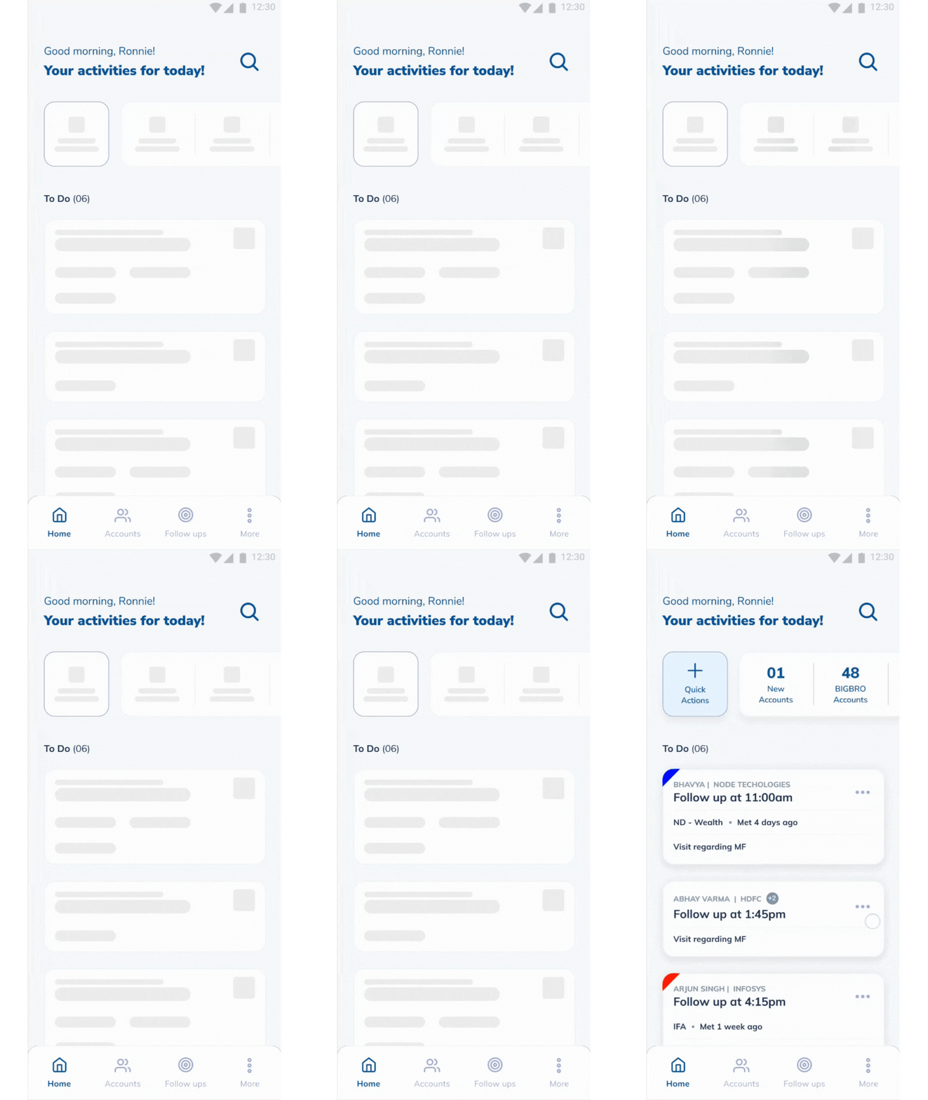
Loading State

An animated loader was introduced during data sync to reduce perceived wait time and reassure users that the app was working in the background.
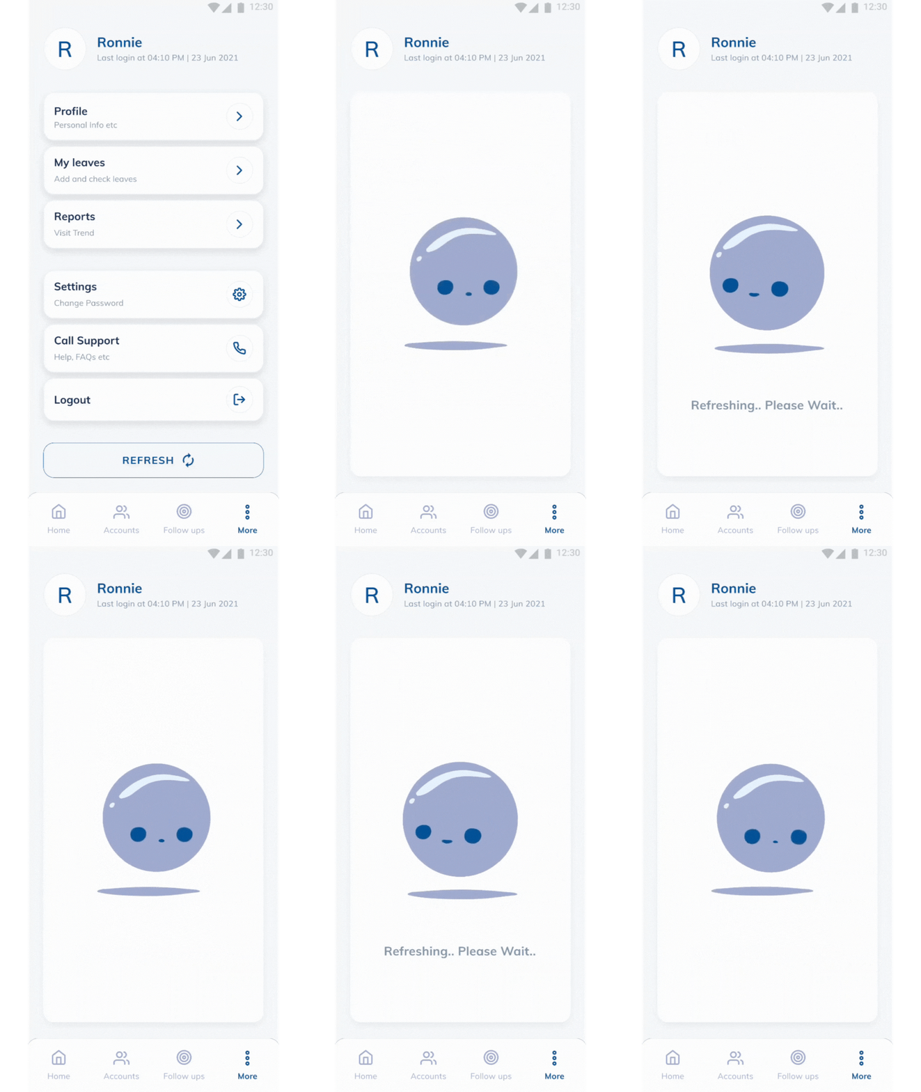
Refresh

Instead of a static reload, the refresh button was animated with a smooth rotation effect. This not only provided feedback but also made the action feel more dynamic and intentional.
Details
The idea was to display a summary of the forthcoming meetings on the home screen, allowing users to swiftly prepare for and gain an understanding of the meeting with just a glance.


DESIGN SOLUTION
SalesGo 3.0 delivered:
-
Quick onboarding and account creation for new users.
-
Mobile first quick logging tools for executives and managers.
-
Transparent upgrade flows for smoother adoption.
-
Accessible and consistent UI backed by a design system.
Onboarding and Account Creation
Before: The UI was complex and onboarding took longer than expected.
After: User-friendly design for quick onboarding and account creation
Onboarding

Before
After
Home Screen

Before
After
Accounts List and Details
Before: Limited details and hidden filters made account browsing slow.
After: Richer details, clear filters, and improved hierarchy made account management faster and easier.
Accounts List

Before
After
Accounts Details

Before
After
Follow Up and Reports
Before: Follow-up tasks were unstructured and easy to miss, while reports presented unclear data spread across multiple screens.
After: A structured follow-up view with clear reminders and a unified dashboard with organized data made it easier for users to track client commitments and analyze performance.
Follow Up

Before
After
Reports

Before
After
LAUNCH
The redesigned SalesGo 3.0 launched on the Google Play Store in 2022 and quickly gained traction:
-
1,000+ downloads in the first few months.
-
Positive adoption by multiple large Indian banks.
-
Continuous improvement planned for versions 3.1 and 3.2.


80%
Accessibility and design system reduced user errors.
90%
Consistent UI improved usability and development efficiency.
IMPACT AND OUTCOMES
65%
Engagement and adoption increased with streamlined flows.
100%
Onboarding and update flows validated across users.
